Del.icio.us reflex
- Posted
25 April 2007
To thank everyone who spent the time to send me feedback on my NetNewsWire style, Ollicle Reflex, I’m publishing a new version. It fixes a couple of popular problems and introduces some del.icio.us love.
If you are not already familiar with what Ollicle Reflex has to offer NetNewsWire check out the features detailed on my previous post. Otherwise download it and find out for yourself.
Download and install (Updated see: Ollicle Reflex refined.)
Download latest version: Ollicle Reflex
I have removed the link to Ollicle Reflex Black. There is a new method for setting Black as the default background.
Double-click the unzipped .nnwstyle file and NetNewsWire will copy it to where it needs to be.
~/Library/Application Support/NetNewsWire/StyleSheets/
Like the original release, this style uses JavaScript to do some things CSS alone cannot. Make sure you enable it
- NetNewsWire Preferences
- Browsing
- News Items
- Enable JavaScript
- News Items
- Browsing
Requires at least NetNewsWire version 2.1 (lite or full). The JavaScript driven magic of the style fails in NetNewsWire 2.0.1 – I have not spent the time to figure out why. Although, it does work nicely in the lovely NetNewsWire 3 Sneak Peak Release.
Changes
Fixes
-
Cookied skin selections we’re failing to ‘stick’ when using the style file name (e.g. ‘Ollicle Reflex black.nnwstyle’) to set the black skin by default.
-
Removed a poorly implemented ‘feature’ which toggled the display of highlighted differences in feed content with cursor position. More on this below.
New features
-
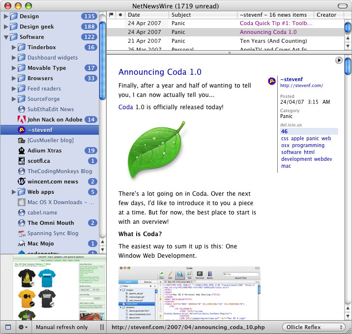
Displays a del.icio.us Tagometer Badge for each viewed news item. This shows you how many del.icio.us users have tagged the news item you are viewing and the top ten tags they used.
-
When NewNewsWires Highlight differences option is checked, items of deleted content are indicated with an inline ▲. Clicking each triangle toggles the display of that particular item of deleted content individually.
Some back story
Perseverance rewarded with tags
Having recently worked out how to load jQuery into a NetNewsWire style, when I read about the introduction of the del.icio.us JSON API, I saw the potential for integrating it into a NNW style immediately. Figuring out the technical details to make it happen took me a lot longer. PPK on JavaScript helped me fill the necessary holes in my patchy JavaScript knowledge. It’s a wonderfully practical book I recommend to anyone struggling with the basics of JavaScript.
My perseverance was rewarded. The del.icio.us tags are particularly informative when viewing some del.icio.us generated feeds that are often lacking a useful descriptions. The top tags often tell me whether the bookmarked web page is one I wish investigate further or ignore.
It’s worth noting that feeds served up with feedburner -redirected urls do not work. Because no one bookmarks feedburner urls on del.icio.us they will appear as ‘untagged’ in Ollicle Reflex.
When a feature becomes a bug
NetNewsWire has a nifty feature named Highlight differences by its preference
checkbox. Additions and deletions in the content of updated a posts are marked
up with ins and del tags respectively. Although
it’s often useful and interesting to see how an author has edited their
posts – the red and green can be quite distracting to normal reading.
Reflex (and my previous styles) included a feature to hide and show these differences by moving your cursor over the body of the post. This confused many people who had not ‘read the manual’ and understandably interpreted the occasionally frantic flickering as a bug.
Ultimately my implentation of this feature was too subtle; And the difference between a subtle feature and a bug is a fine one indeed. I have read advice to this affect from a number of software developers who have learnt this lesson the hard way. It’s enlightening to experience the problems caused by poorly advertised features first hand.
This version of Ollicle Reflex does away with the cursor over the body technique to instead require a directed mouse click from the user to display each deletion. Hopefully people will find this behaviour less mysterious.
Further thoughts
16 June 2007
Updated to version 5 to fix an issue with the version of Webkit installed with the Safari 3 beta. Download above.
10 March 2008
Another update with a bunch of improvements: Ollicle Reflex refined